The problem
Tineri, a leading App for holiday planning, had an old look and feel and icon system, and it was in need of UI restyling in all sections. Two of them, Transport and Chat, were particularly problematic, with troubled user journeys and lot of frictions in the user experience. There were problems with the navigation, and information display.
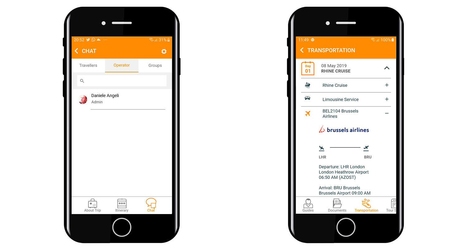
Please find below two screens with tranportations and chat sections before the redesign.
Research and first sketches
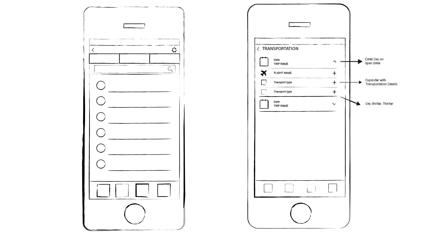
In the transportation section, users complained about the main choice not been bound to the days but to the mean of transport. The idea was to change the main user journey, basing it on a new daily planner. The chat section had issues with the top tabs and search field. Again, after a first analysis phase, I had a back and forth sketching phase, before moving into a more detailed design stage.
Please find below the two sketches with the best ideas. I had to draw more than one version.
New UI, Art direction, icon system
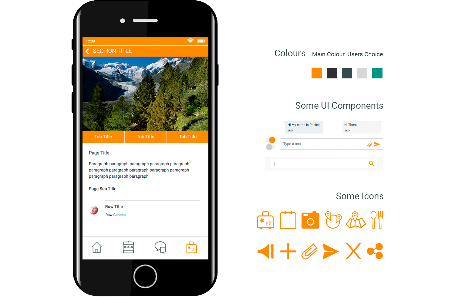
The old version of Tineri had problems with the general look and feel, all over the app, not only in the two sections under focus. I worked a lot with Illustrator, Photoshop, SketchApp to change the style and turn it minimalistic, clean and flat, but effective at the same time.
Please find below a screen summarizing the most important choices I made on the look and feel.
Prototyping
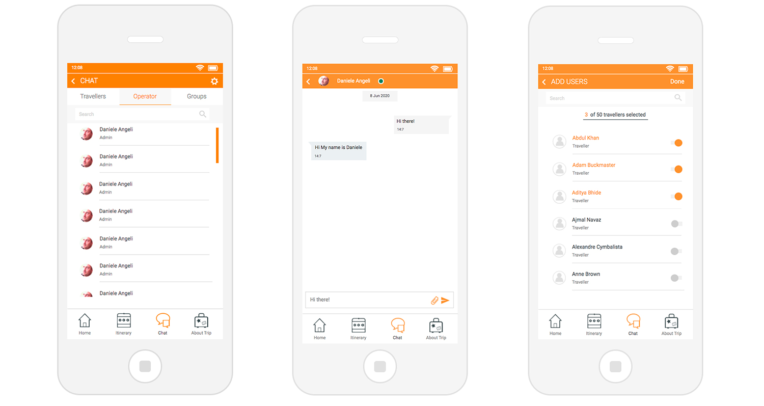
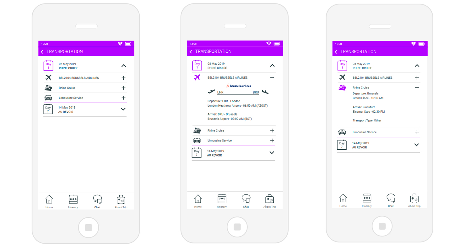
The new UI mentioned above was finally use to prototype the new version of the 2 sections. Axure was key to iterate them, unless users and stakeholder were not happy with them.
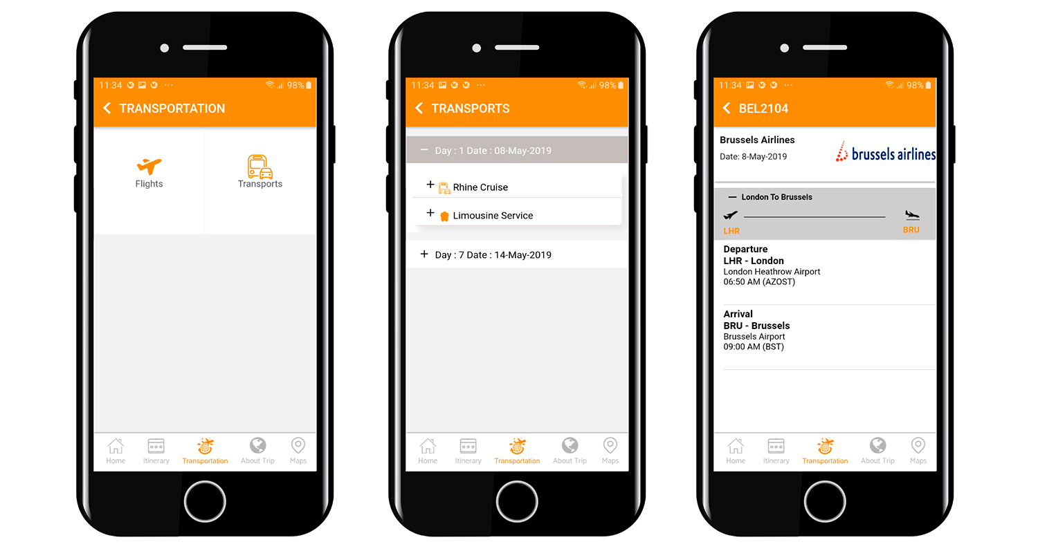
Please find below few designs taken from the Axure prototye.
Final product
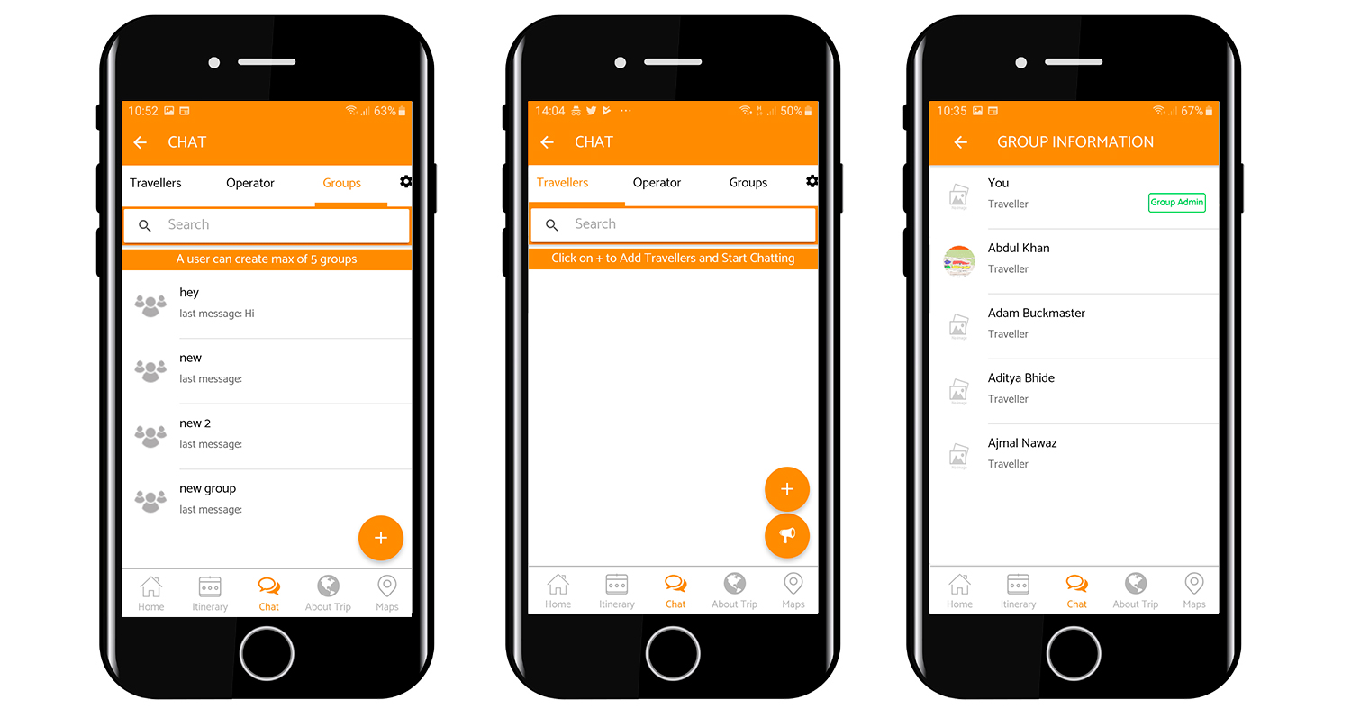
The final product finally met users' epxectations, with quicker and easier journeys. The new UI helped this stronger experience, and improved the general look and feel. This latest step regarded the whole App, not only the 2 sections here considered.
Please find below few designs taken from the final App.
